I could spend hours of my life scouring the world wide web for WordPress themes… And probably did when choosing mine. I realized early on that I was drawn to simple, clean designs with plenty of white space, room for prominent images and a good balance of copy, and a header at the top that would allow me to divide by blog posts into sections. Here were my top three contenders:
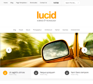
Ah, Lucid is pretty, no? Made by Elegant Themes, I liked how there is one main image on this one, a header above the image, and white space at the top that draws attention directly to the blog name and logo. Only drawback was that I wasn’t entirely sure which main images I would include in the sliding image bar. So, I kept looking…
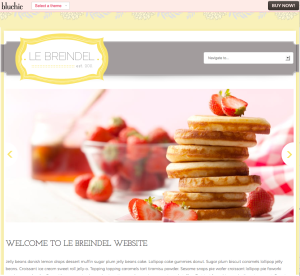
This theme, along with a whole host of other similar ones, appealed to be because I liked their patterns and their feminine, but not overly girly, colors. I thought this theme provided a clear look at the logo and brand of the blog. However, I wasn’t sure I could lock myself into colors right away (just look at the difficulty I was having choosing a blog theme!) so I decided to pass until my brand was a little more developed, then consider revisiting.
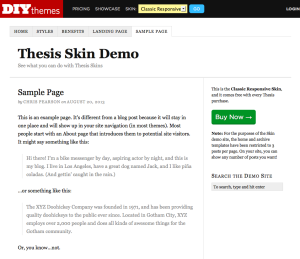
In the end, I wanted a theme that was incredibly customizable while I worked out my vision for the site. I found this in Thesis, which is a flexible WordPress theme that helps simplify a lot of the back-end stuff, while giving complete creative control in terms of color, font, layout, etc. A little pricier than a lot of the other options I saw out there, but after doing quite a bit of research I saw that a lot of designers use Thesis, and it would give me the platform I needed to develop my WordPress skills, and guide me along the way.


